Interaction of Color 1963 by Joseph Albers is in the classic of color theory, but its respects to the practice the design, has passed on the teachings of Bauhaus and it has not gone old.
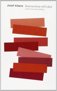
https://www.amazon.com/Interaction-Color-Anniversary-Josef-Albers/dp/0300179359
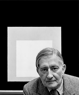
Josef Albers was born in Germany in 1888, entered in Weimar’s Bauhaus at the age of 32 in 1920, learned from Johann Itten, one of the leaders of the school, he became a faculty member of the same school in 1923.
(* Josef Albers, source: https://en.wikipedia.org/wiki/Josef_Albers)
When the Bauhaus moved to Dessau and was forced to close down in 1933 by the Nazis, he went to the United States and taught at Black Mountain College.
Black Mountain College is an art school in North Carolina, legendary for the Buckminster Fuller’s Geodesic dome and Mars Cunningham’s theatrical group. In Black Mountain College many known American contemporary artist have pend their younger days, such as Joseph Albers to Robert Rauschenberg and Cy Twombly.
Then Albers moved to Yale University in 1950 and continued teaching until he retired in 1985 as a chairman of the Department of Design. “interaction of color” is based on the of the lecture at that time.
Joseph Albers has published various works as an artist as well as an art educator. The “Homage to the Square” or “Manhattan” painted in the lobby of Pan-Am building (Metlife building) are the well known works of his.

(*Josef Albers Homage to the Square, 1951:
Source: http: //www.albersfoundation.org/art/josef-albers/paintings/homages-to-the-square/#slide13)
Pan-Am Building was designed by Walter Gropius who was a teacher at the Harvard Graduate School of Design and founder of Bauhaus. The lobby of the former Pan-Am Building was a collaboration space for two giants with roots in Bauhaus. (Mural paintings have been removed since 2000)
(* Josef Albers Manhattan, 1963 source:
Http://www.albersfoundation.org/art/josef-albers/architecture/#slide7)
The most unique part of ” Interaction of color ” is not the color theory or manual based on scientific analysis, but to experiment with using colors. It is actually a book of practice. It can be said that the stance of actually trying is true Bauhausism.
Michiko Yamawaki who actually studied under Albers at Bauhaus said, “Even if you make Alberus, Kandinsky, or Schmidt,they do not tell you “Do this way, or the other way” tell the students to think with their own heads. It’s all about how students themselves can learn with their body. I strongly felt that this is the kind of thing that to learn the basics of design. ” (“Bauhaus and the tea ceremony” Michiko Yamawaki 1995)
And the content of practice color is thrilling.
For example
Show three colors to two colors. The small square inside seems to be brown and purple on the opposite side ground color, but actually it is another third color.
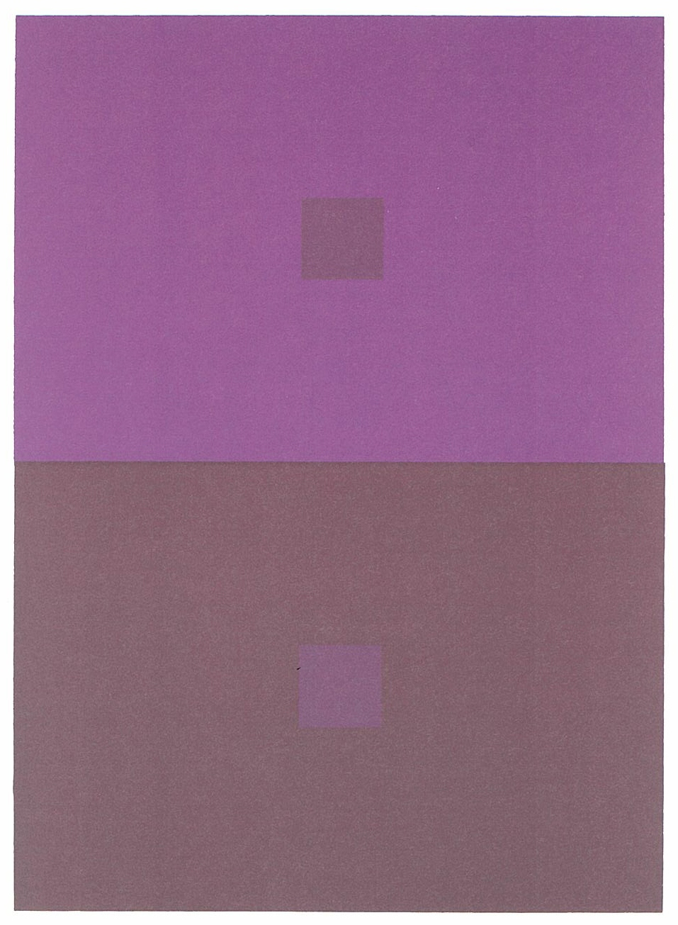
(* From Joseph · Albers “designing color scheme”)
Even colors on the same plane will appear stereoscopically due to the difference in hue. The lower row shows black above, and the upper row seems to have cream on top (transparency and spatial illusion).
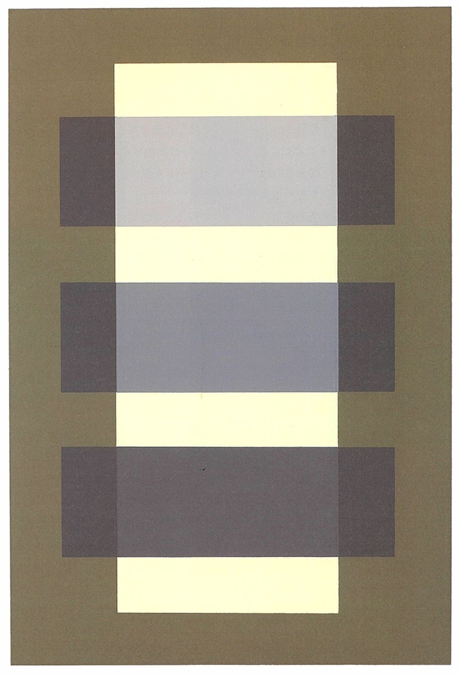
(* From Joseph · Albers “designing color scheme”)
It seems that adjacent colors are mixed (Optical color mixing or Bezalt phenomenon). The upper and lower red are the same color, but the upper red looks brighter than the lower red.
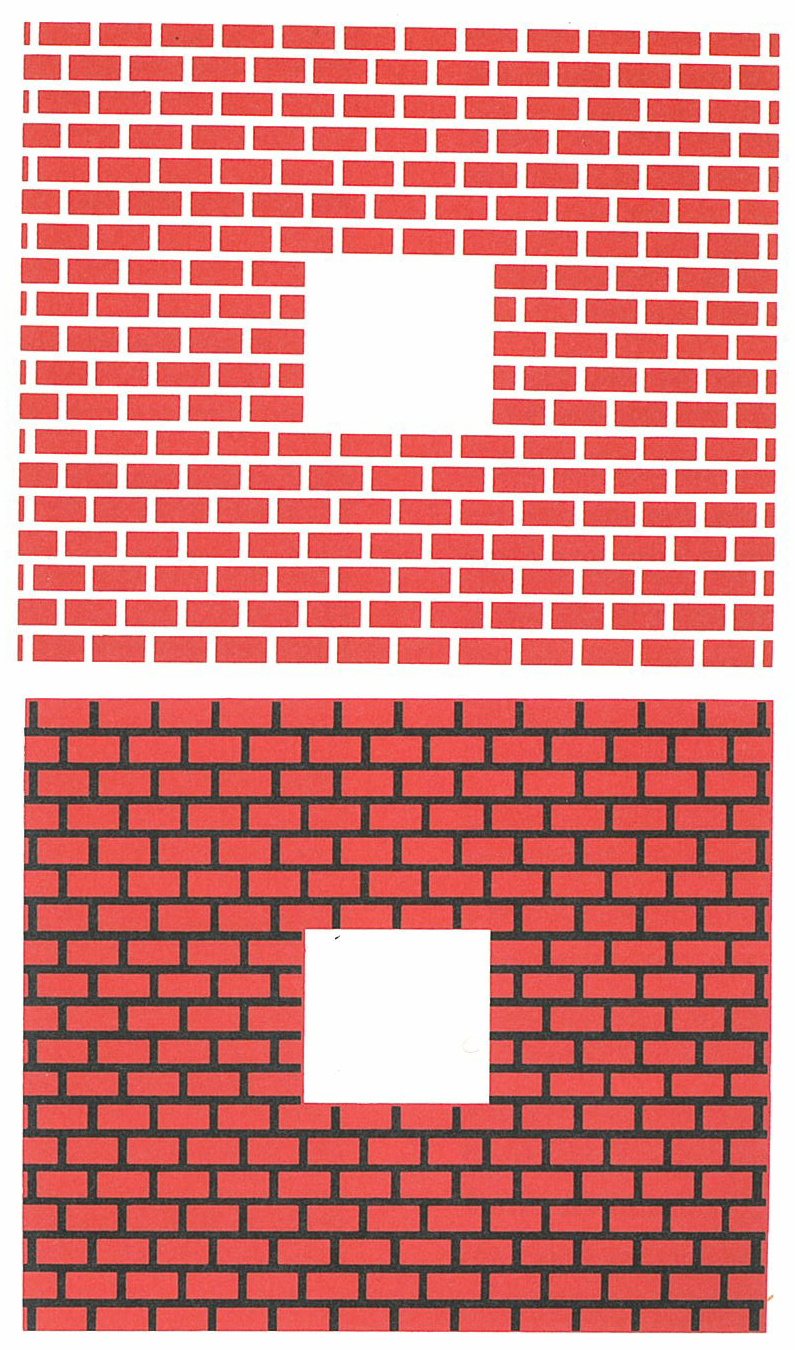
(* From Joseph · Albers “designing color scheme”)
Where he talk about colors in relation to paintings, music and theater is also interesting not found in similar books.
Alberse explains that the celestial sense of Cézanne’s paintings was derived from the recognition of color interactions and that the expressions of many Impressionist painters aimed at optical color mixing.
Sound can be accurately measured by wavelength. Therefore, music can be described in a graphical way as a note. On the other hand, with regard to color, the projected color can be measured by wavelength, but it is difficult to accurately measure the reflected color, that is, the colors of the paints and pigments that we are most familiar with. Even if reflection color is measured with an electronic spectroscope, it seems that it contains all colors. Furthermore, the color has characteristics that it changes with shape, size, repetition and placement, which is the reason why color does not inherently accept a diagrammatic description.
Conversely, like an actor, colors abandon themselves, influence each other and change each other. “In our perception, colors are constantly interacting with each other”, he says.
Albers declares this.
“We must pay attention to the” commercialized color proposal “for interior, exterior, furniture, textile decoration, and DIY according to the (harmonic) color scheme. The conclusion is this. For a while you can forget the rough way like complementary colors, adjacent complementary colors, triads, teterades. They are useless. ”
“A good picture or a good coloring can be compared to a delicious dish It is necessary to taste it repeatedly during cooking no matter how you make it according to the recipe, and the best tasting is still dependent on” the discerning tongue ” ”
Joseph Albers who sticks to thoroughly to “open eyes”. It is a useful one for designers and practitioners of design and artists as well.
text by Tetuya Omura
* References :
Joseph Alberth “Design of color scheme”, PNN Corporation, 2016
An iPad application that lets you interactively learn the color theory of Joseph Albers is on sale. For details click here http://yupnet.org/interactionofcolor/)


